Campaigns, products, motion and content. Everything is below, or pick what you want to see.
18 projects, written up from brief to outcome.
Brand strategy & integrated campaigns
End-to-end campaign work: live events, launch arcs and broadcast spots, each made for a specific audience at a specific moment.
Live event
Attendee experience
Vendor management
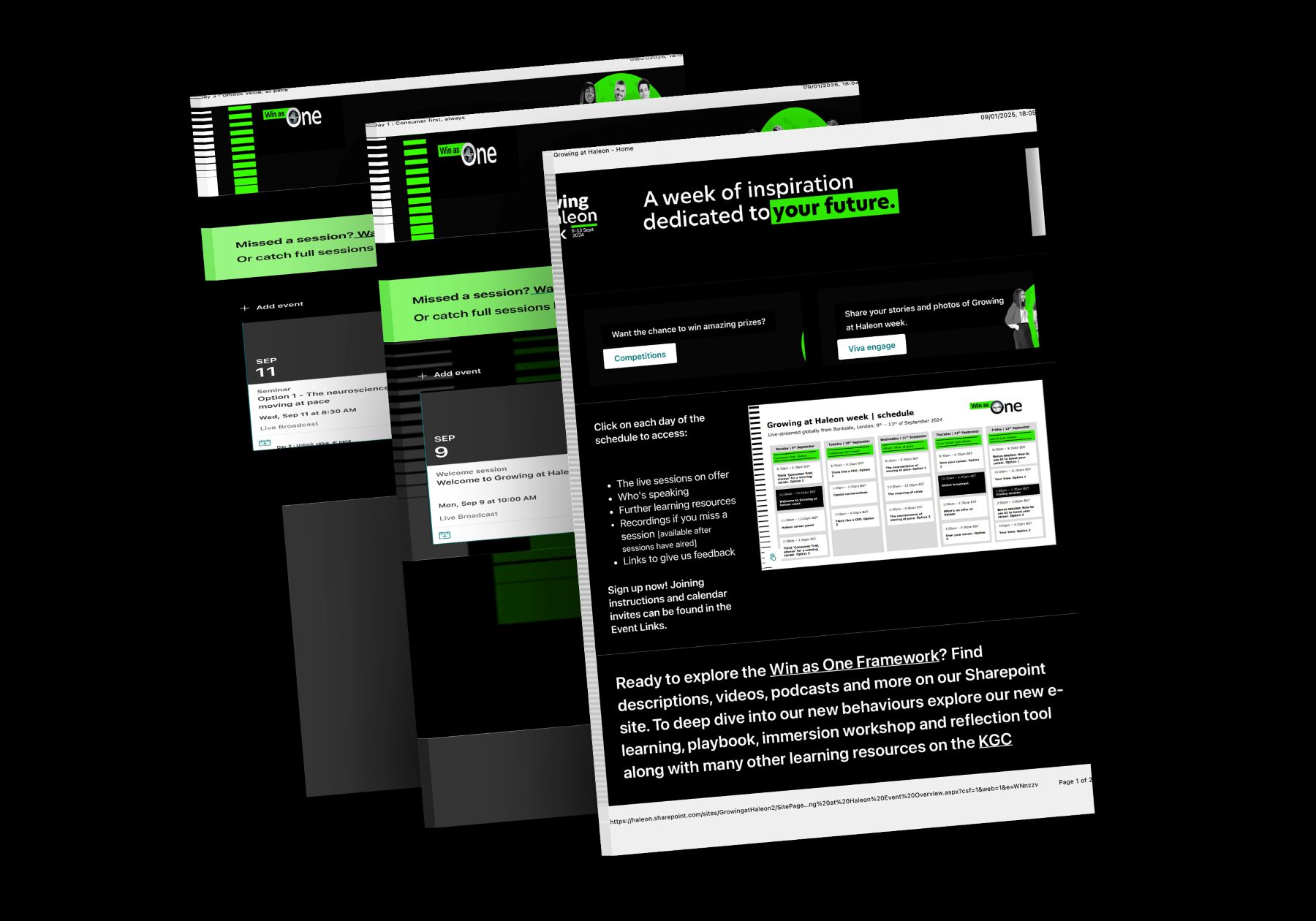
Growing at Haleon: Haleon's biggest-ever global employee event
Designed the attendee experience for a fully virtual global week, made internal videos for it and managed the broadcast vendors. It became the most-attended global event in Haleon's history.
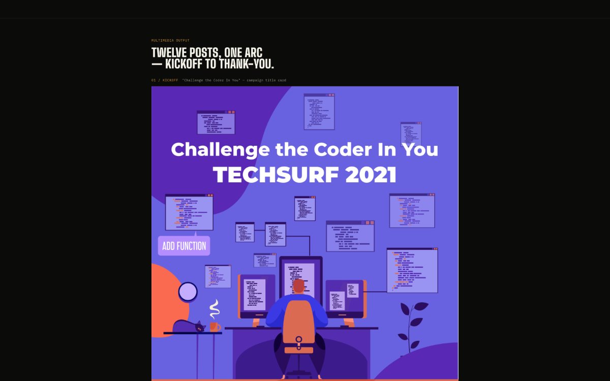
TechSurf 2021: keeping a hackathon urgent for weeks
Designed and wrote all twelve posts for Contentstack's coding challenge, with one illustrated system that carried a kickoff, a task reveal, two deadline extensions and a live countdown.
Brand identity
Campaign design
Recruiting
TechSurf 2022: giving the event its own identity
Brought back for the third edition: a gear-and-globe mark, a campus recruiting one-pager, and a social system that held across banner, feed, story, web and email.
QuarkXPress · Seasonal campaignsSame product, a different voice for every moment.HalloweenThanksgivingBlack Friday
Campaign
Creative direction
Digital ads
QuarkXPress: seasonal campaign videos
Halloween, Thanksgiving and Black Friday videos, each pitched to its moment in the calendar while staying recognisably QuarkXPress.
Broadcast
Motion design
Illustration
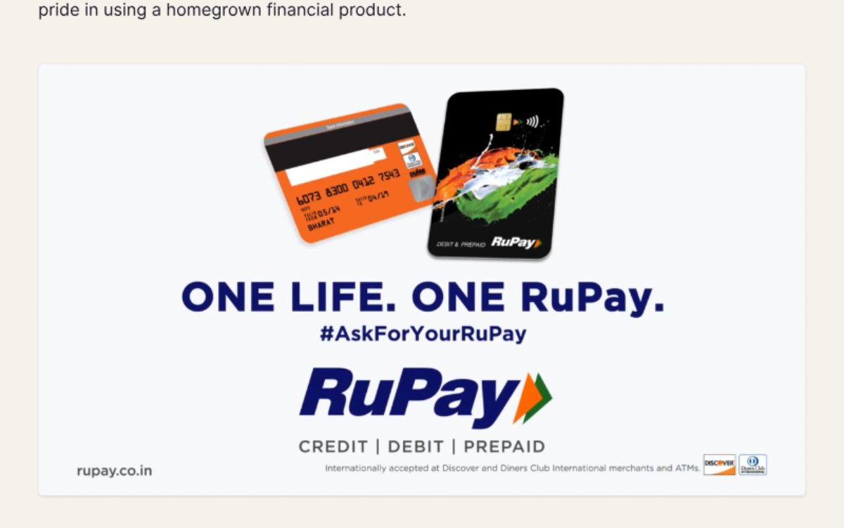
RuPay International Debit Card: a 30-second national TV spot
Illustrated and animated a promo that aired nationally during the Hockey Premier League, showing a homegrown card that works around the world.
Marketing & content design
Brands, newsletters and emailers built as systems, so a small team could publish well every week.
Editorial design
Email
Brand identity
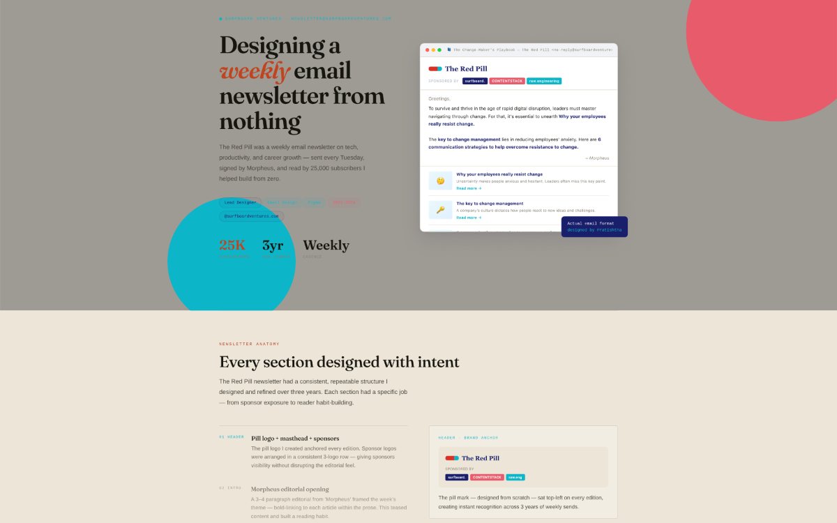
The Red Pill: a weekly newsletter designed from nothing
Three years of Tuesday sends on tech, productivity and careers, built on a section-by-section layout that helped grow the list from zero to 25,000 subscribers.
Brand identity
Social design
Content system
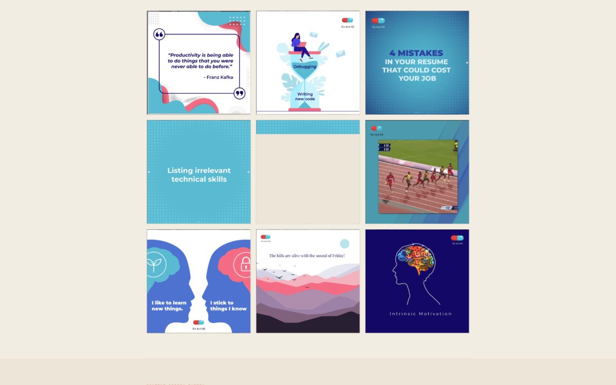
The Red Pill: a social media design system
The brand, illustration style and six content formats behind The Red Pill's Instagram, designed solo and run weekly for two years alongside one writer.
UI design
Motion
Email marketing
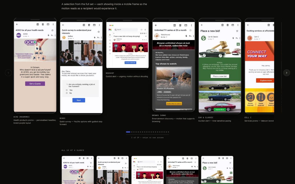
Netcore Cloud: brand-led emailers, designed and animated
Emailer flows for 19 brands and use cases on Netcore's B2B platform, each turned into a short looping animation so clients could see their brand moving in the inbox.
Virtual job fair · 2020Job Expo 2020Nine videos for a job fair made during lockdown, with every speaker filming alone.
Illustration
Animation
Remote direction
Job Expo 2020: one event, filmed in separate rooms
Illustrated, animated and edited a full video set for a virtual job fair, directing every speaker remotely so laptop and phone footage still read as one production.
Motion systems & video production
Explainers, launch films and recurring series, from script and shoot direction to the final edit.
Motion system
Explainers
Voiceover direction
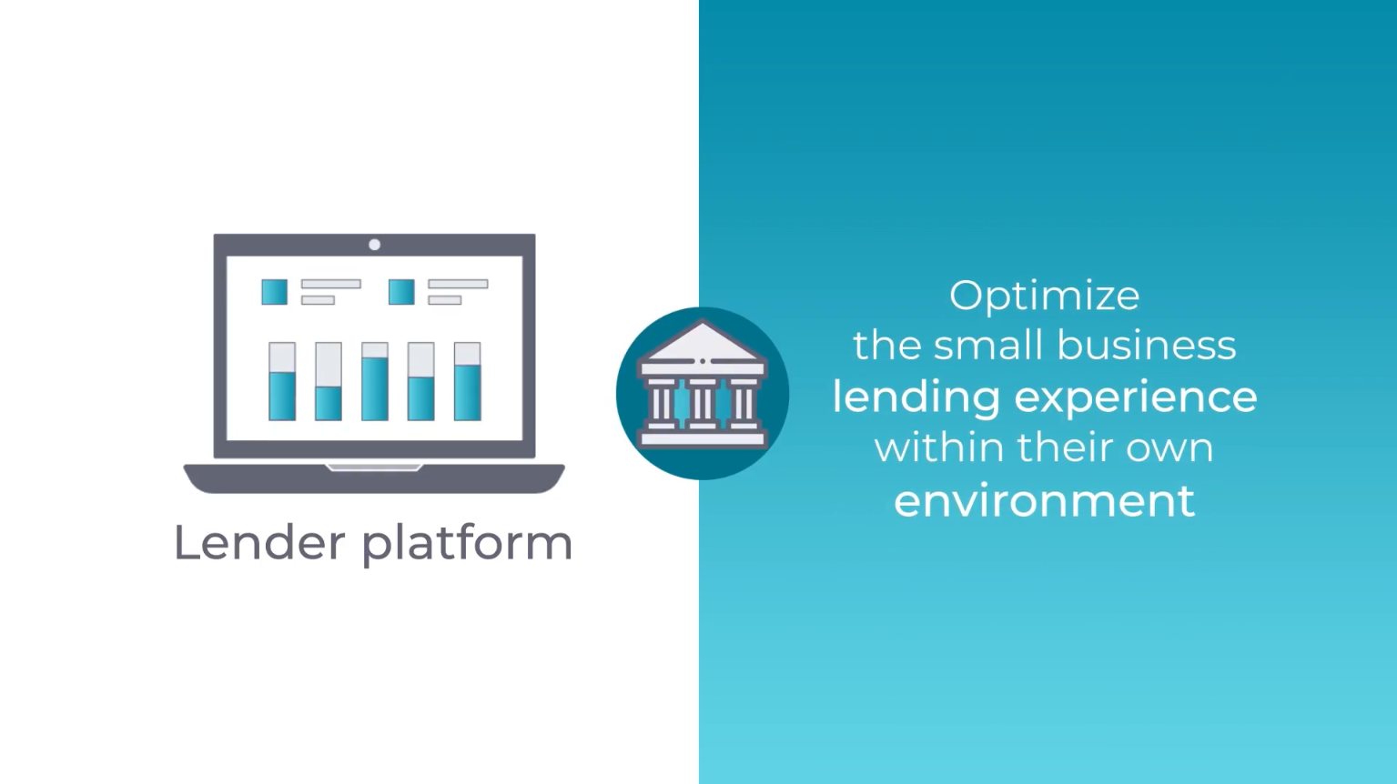
Biz2Credit: a 40-part fintech glossary
One modular Figma and After Effects system turned dense finance terms into 40 short, consistent explainers, with the voiceover sourced and directed across the series.
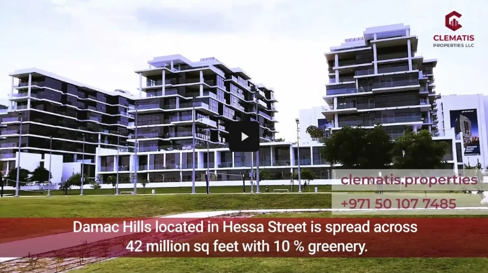
Clematis Properties: 14 cuts for buyers who don't share a language
Sent shoot direction to the crew in Dubai, then edited every cut from London, holding one visual system across presenters, locations and six languages: English, Arabic, French, Spanish, Bengali and Hindi.
Biz2Credit #TechTuesday: a recurring CTO video series
Owned every stage of an in-house YouTube series with CTO Vineet Tyagi: scripts, locations, camera, lighting, on-camera coaching, edit and publishing.
QuarkXPress · Monthly release cycleWhat's new, every month.
Script
Film
Edit
Motion
QuarkXPress: monthly feature-release videos
Scripted, filmed, edited and animated a "What's new" video for every QuarkXPress release, solo and on a monthly deadline.
Trendlyne · Motion graphicsMarket data, made watchable.INVESTORUSERSOCIAL
Explainers
Product video
Social
Trendlyne: one platform, three audiences
Investor explainers, user-facing product videos and short social cuts for a market-data platform, each paced for its audience and all recognisably one brand.
Logo animation
Launch film
Marketing
Kyral: the launch film for a creator app
Designed the logo and its animation, then made the launch and marketing videos for Kyral, an app from Appyhigh Technology that was later discontinued.
Script
2D animation
Voiceover
Arena Interiors: a 2D explainer made end to end
Wrote, animated and voiced a portfolio explainer for an interior design studio, built to hold attention without a presenter in the room.
Product & UX
Where motion and documentation turned into product work: shaping MVPs, design systems and how users learn them.
Product design
UX research
Motion
Biz2X MVP: from pitch-deck support to product partner
Brought in to package an SME lending platform for investors, I ended up shaping it: personas, flows, motion prototypes and a 60-second investor film.
Design system
Onboarding
Motion
Contentstack Venus: adoption, not just a visual refresh
Tutorials, animated interactions and old-to-new diagrams that helped a technical user base move to the Venus design system, plus the video pipeline for Accelerate.
What's next?
Have an interesting project and want help telling it in motion?
TechSurf 2021: sustaining urgency across a messy campaign arc
TechSurf 2021 was Contentstack's coding challenge for developers outside the company, with a cash prize and a possible route into the team. I designed and wrote every post in the campaign, from kickoff to thank-you.
Client
Contentstack
Role
Designer & copywriter
Output
12 posts, 13 assets
Channels
LinkedIn, Instagram, Twitter
The brief
A hackathon doesn't succeed on its announcement post. It succeeds if people are still paying attention when registration closes, and closes again after the deadline moves. The campaign had to carry a kickoff, a task reveal, a check-in while people were mid-challenge, two separate deadline extensions (to 20 and then 22 September), a live countdown and a send-off, without reading like a dozen unrelated posts.
One illustrated system for every beat
Colour: every post sits on the same violet-to-indigo gradient, with one coral accent doing all the urgency work: CTA buttons, highlight circles, countdown numerals.
Illustration: flat figures at laptops, gears, wrenches, hourglasses and a finish-line runner make the "challenge" metaphor literal, so a feed of posts reads as one story.
Motif: a faux code-editor window, rows of syntax-highlighted lines, runs behind the title card, the HTML-tag-styled check-in and the hero. It signals "developer campaign" without the word "code" in every headline.
Formats: the thank-you post was adapted for square (LinkedIn, Instagram) and widescreen (Twitter) feeds.
Outcome
I don't have reach or registration data for this campaign, so I won't put a number here. What the brief itself shows: Contentstack extended registration twice because more coders wanted in, and the campaign system stretched to cover both extensions without breaking.
Contentstack · Identity, social & recruiting · 2022
TechSurf 2022: a third edition with a bigger remit
Contentstack brought me back for TechSurf's third edition, and the brief grew with it: the event's own identity mark, a recruiting piece for universities, and a social system built to hold up across banner, square, story, web and print. I designed and wrote the copy for all of it.
Client
Contentstack
Role
Designer & copywriter
Output
14 assets
Channels
Social, web, email, print
The brief
The prizes were more specific this time, with a cash prize pool and a real job on the table: an Associate Application Engineer role at ₹15 lakh a year for whoever cleared the interview round. The campaign also added a channel 2021 didn't have: campus outreach.
Giving the event a mark
2021 had no mark of its own, so the code-editor motif had to explain the event. For 2022 I designed a globe inside a gear, with a gradient running from coral into violet through the centre and navy holding the rest. The globe says "global talent, open to anyone"; the gear says "a challenge, something to solve". I explored three treatments (blob, cube and code) for the prize announcement before shipping the wavy-blob direction.
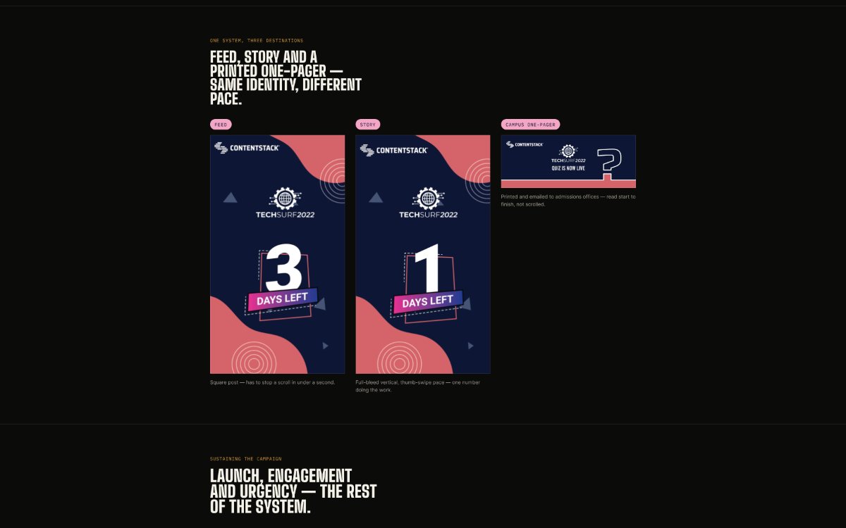
One system, three destinations
Social: square feed posts built to stop a scroll in under a second, and full-bleed vertical stories where one number (3 days left, 1 day left) does the work.
Web and email: the identity carried into the site header, landing banner, featured-challenge homepage block, footer and campaign emailer.
Print: an A4 one-pager written directly to universities, inviting their 2023 batch to take part. It was printed and emailed to admissions offices, so it had to be read start to finish, not scrolled.
Because the mark now carried the meaning, the code-editor windows came off the backgrounds. Soft wavy blobs in coral, navy and pink went on instead, the same accent language as Contentstack's own site, tying the event closer to its parent brand.
Outcome
I don't have reach, registration or hiring numbers. What I can point to is the shape of the brief: the client who had run a year of this campaign with me came back and handed over more of it.
QuarkXPress · Seasonal campaignsSame product, a different voice for every moment.
QuarkXPress · Seasonal campaign video
Seasonal campaigns: same product, different voice
QuarkXPress ran promotions around the big retail moments of the year. I produced the campaign video for each one, so the same product could speak into three very different moods.
Client
QuarkXPress
Role
Video producer & motion designer
Moments
Halloween, Thanksgiving, Black Friday
What I did
Produced the seasonal campaign videos for Halloween, Thanksgiving and Black Friday.
Adapted the tone and visual language to each moment in the calendar.
Kept the brand recognisable across all three, so each spot still read as QuarkXPress first and season second.
Why it matters
Seasonal work is high-intent and short-lived. A campaign has to land in its moment and then step aside for the next one, without the brand starting from scratch each time.
Broadcast commercial · Motion graphics · National TV
RuPay International Debit Card: promotional video
A 30-second promo for the RuPay International Debit Card, showing a homegrown card that works around the world. It aired nationally during the Hockey Premier League.
Client
Creative agency (confidential) for RuPay
Role
Motion designer
Length
30 seconds
Timeline
3 weeks, concept to air
The brief
Show RuPay's international acceptance and convenience to a large national audience, with a message of empowerment, accessibility and pride in a homegrown financial product. I worked with the agency's brand and script teams to turn their campaign idea, "Indian innovation connecting globally", into a visual story.
How it was built
Visual style: clean, modern graphics drawn from India's national colours for instant brand recall.
Illustration: stylised vector scenes in Illustrator for travel, global payments and everyday moments.
Motion: layered animation, camera moves and light effects in After Effects, with transitions built around movement to echo fast digital payments.
Edit: assembled and timed in Premiere Pro to the soundtrack, keeping the energy up for all 30 seconds.
Outcome
The spot aired nationally during one of India's most-watched sporting events. The agency praised the delivery for its visual quality, timely execution and consistency with RuPay's brand tone.
The Red Pill: a weekly newsletter designed from nothing
The Red Pill was a weekly email on tech, productivity and career growth, sent every Tuesday and signed by "Morpheus". I designed it from the first edition and refined it over three years as the list grew from zero to 25,000 subscribers.
25Kemail subscribers
3 yrsunbroken weekly sends
Weeklyevery Tuesday
Every section had a job
Masthead and sponsors: the pill logo I designed anchored every edition, with sponsor logos in a consistent row of three: visible without breaking the editorial feel.
Morpheus's opening: a short editorial framed the week's theme, with bold links to each article inside the prose. It teased the content and gave readers a reason to click before reaching the cards.
Three curated articles: image, blurb and "read more" in a card layout designed for scanning and click-through.
Sponsored section: Contentstack articles in the same card layout, under a clearly labelled divider, so sponsor content felt native but never deceptive.
Tool review: a weekly tool spotlight in a fixed mini-format (name, description, pros). It became one of the most-clicked sections.
Footer: social links that grew the Instagram following alongside the list.
Why it was designed this way
The Matrix persona gave the newsletter a voice that felt like a tip from an insider, reinforced by the pill logo and the sign-off. The rigid tool-review format was deliberate too: readers knew what to expect and where to find it, and habits are built through repetition.
What three years of Tuesdays taught me
A reusable template system let me ship a polished edition every week in a fraction of the time. The structure was the product.
The best layout decisions came from understanding what each issue's writing was trying to do.
A trustworthy, well-structured email gets forwarded. Design was a growth lever, not just decoration.
Surfboard Ventures · 2021–2023
The Red Pill: a social media design system
The Red Pill launched with no audience, no brand and no content system. I joined as its founding designer and spent two years building everything visual, alongside one content writer.
Role
Lead designer & brand creator
Team
1 designer, 1 writer
Tools
Figma, Illustrator
Goals
Audience growth, awareness, newsletter sign-ups
Starting from zero
No identity: no logo, palette, type or visual language, including the pill icon that became the signature mark.
No audience: zero followers and zero subscribers on day one, and no paid acquisition. Growth had to come from the content.
Two channels at once: Instagram feed posts, carousels, Stories and Reels, plus the weekly email, all from one flexible system.
Six formats, one brand
Carousels: bold halftone covers with one digestible insight per slide.
Reels covers: headline-first thumbnails with the logo always top-right.
Quote posts: typographic cards with the brand's rounded border, blob corners and dot motifs.
Infographics: mindset comparisons, radial hubs and silhouette illustrations, with a custom icon library drawn in Illustrator.
Engagement posts: Friday posts, polls and mood pieces in a playful tone.
Newsletter: the weekly email, aligned with the Instagram brand.
A lean weekly process
Brief with the writer, choose the format, design in Figma with illustrations from Illustrator, adapt for the newsletter, review together and publish. That loop ran every week for two years.
Outcome
A complete brand and content system built from zero, and 25,000 organic newsletter subscribers. Consistent colour, type and composition across Instagram and email made the brand recognisable, and that recognition built trust.
Netcore Cloud · UI & motion · 2024
Netcore Cloud: brand-led emailers, designed and animated
Most email platforms give marketers a fixed set of template blocks, so emails end up looking alike. For Netcore Cloud's B2B platform I designed custom emailer flows for client brands, then animated them to show what each brand could feel like in the inbox.
19animated emailers
4–7screens per flow
B2Bmarketing teams
Role
UX/UI & multimedia designer
Team
Business, development, sales
Tools
Figma, After Effects
The challenge
Clients struggled to follow their own brand guidelines inside generic templates. The emailers had to be flexible enough for very different brands, simple enough for marketing teams to use every day, and distinct enough to stand out in a crowded inbox, where a moving element is one of the few ways to get noticed.
What I did
Designed the main emailer flows, each four to seven screens, and used those screens as the storyboard for the animation.
Created brand-specific layouts, colour and type for each concept: insurance, telecom, streaming, auctions, recipes, gifting, ratings and more.
Animated each flow as a looping GIF shown inside a mobile inbox frame, so clients saw the motion as a recipient would.
Some concepts came from client conversations; others were pitch concepts, where the animation had to sell the idea to people who weren't in the room.
Key decisions
Structure first: a clear screen order, so each flow and its animation could be followed without confusion.
Brand before template: each client should feel represented, not generic.
Practical over overdesigned: motion a marketing team could actually use, not effects for their own sake.
Outcome
Clients got a more flexible, brand-led way to build emailers. The project taught me that in a B2B product, motion has to carry the brand and still work in real daily use, not just in a presentation.
Virtual job fair · 2020Job Expo 2020
Video production · 2020 lockdown
Job Expo 2020: one event, filmed in separate rooms
Job Expo 2020 was a virtual job fair held while the world was in lockdown. I illustrated, animated and edited its full video set, and because nobody could be filmed in person, I directed each speaker remotely so they could shoot usable footage on their own laptops and phones.
Client
Job Expo 2020
Role
Illustration, animation, editing, remote direction
Output
8 finished videos
One brand to hold it together
An animated ident opened every video: the WINS Jobs mark, the Job Expo 2020 handshake logo and the event URL, always on the same indigo. Every explainer, interview and social cut drew on the same small palette and type, so a laptop webcam in Singapore and a studio piece in a shirt and tie could sit in the same series.
What shipped
Animated logo ident for the whole series.
Illustrated explainers: one for candidates, with flat characters at three desks for experienced hires, freshers and work-from-home seekers; one for the platform's courses and certifications in the same style.
Presenter-led explainer: deliberately the plainest video in the set, straight to camera, because everything around it was animated.
Independence Day film: a map of India made from a mosaic of the event's participant video tiles, set against the tricolour with the Ashoka chakra at the centre.
Speaker interviews: three speakers in three rooms, each given shooting notes before the call, then unified in the edit with a lower-third system.
Outcome
The hardest part wasn't any one video. It was making a studio shoot, a beach-backdrop webcam and a home-office recording all read as the same event. The brand kit and the lower-third system did that work.
Biz2Credit · Video production · 2020–2021
#TechTuesday: Biz2Credit's fintech video series
A recurring YouTube series in which CTO Vineet Tyagi talked with Biz2Credit employees about fintech and technology. The aim was to make complex topics feel human, simple and engaging, while building thought leadership around the CTO's voice.
Client
Biz2Credit (in-house)
Role
Multimedia designer, end-to-end video production
Platform
YouTube
What I owned
Scripts: proof-checked and refined for clarity, flow and timing, so every episode felt natural on camera.
Locations and framing: scouted office spaces and planned shots that reflected the brand authentically.
Production: ran camera, lighting and microphones on every shoot.
On-camera coaching: worked with the CTO and employees on posture, eyeline and pacing.
Post-production: edited each episode, added titles and lower thirds, colour-corrected and mixed the audio.
Publishing: published and optimised every video as one discoverable series with consistent branding.
Outcome
A repeatable in-house format that showcased Biz2Credit's expertise and culture, delivered at a consistent quality across the full series.
QuarkXPress · Monthly release cycleWhat's new, every month.
QuarkXPress · Feature-release video · 2020
What's new, every month
QuarkXPress shipped on a monthly cadence, and every release needed a video the moment it went out. I owned that pipeline end to end, on my own, month after month.
Client
QuarkXPress
Role
Script, film, edit, motion
Cadence
Monthly
What I did
Scripted, filmed and edited each monthly release video.
Produced the motion graphics for every release.
Ran the whole pipeline solo, so each release became content as soon as it shipped.
Why it worked
A monthly deadline leaves no room for precious workflows. Owning every stage myself meant each release could go from shipped feature to finished video without hand-offs.
Trendlyne · Motion graphicsMarket data, made watchable.
Trendlyne · Motion graphic artist
Trendlyne: one platform, three audiences
Trendlyne turns stock-market data into analysis. As its motion graphic artist I worked for three very different audiences on the same platform, each needing its own pace and level of detail while staying recognisably one brand.
What I made
For investors: explainer videos that made the platform's opportunity clear and credible.
For users: product videos that walked through features at a pace people could follow.
For social: short-form videos built to catch attention in a feed.
The craft
Market data is dense by nature. The work was deciding what each audience needed to see first: the big picture for investors, the next click for users, one sharp point for social. Then motion did the rest.
Appyhigh Technology LLP · Motion graphics
Kyral: the launch film for a product that no longer exists
Kyral was a creator-discovery app from Appyhigh Technology LLP. I built its logo and logo animation, a product launch video and a marketing video. The product was later discontinued, and the films remain the clearest record of what it was for.
Client
Appyhigh Technology LLP
Role
Logo design, motion, video
Films
Logo reveal, launch film, marketing video
The films
Logo reveal: anticipation, then the reveal, for every Kyral video and launch moment.
Launch film: a full app walkthrough, including five-step setup where the follower counter increments live as each social account is linked.
Marketing video: creator cards filtered by skill and taste rather than follower count, with a drill-down into each creator's content before you commit.
Explainer animation · Arena Interiors
Arena Interiors: a portfolio piece, built end to end
Arena Interiors, an interior design studio, needed a showcase for its portfolio: a 2D animated explainer that walks through its work and process and holds attention on its own, without a presenter in the room.
Client
Arena Interiors
Role
Script, animation, voiceover
Format
2D animated explainer
What I did
Wrote the script.
Animated the full video.
Recorded and directed the voiceover.
Owning script, picture and voice meant the pacing could be decided once and held throughout: every line has a visual, and every visual has a reason to be there.
Biz2X MVP: from pitch-deck support to product partner
When I joined the Biz2X project at Biz2Credit, the MVP didn't exist yet. An external agency was shaping a digital lending platform for small businesses, and I was brought in to "support": turn the work into presentations, documentation and explainer videos for investors. In practice, I ended up helping shape the product.
Role
UI/UX & motion designer
Team
PM, designers, frontend & backend developers
Domain
Fintech, SME lending SaaS
Duration
2 years, pre-MVP to launch
Why Biz2X needed to exist
Borrowers faced long approvals with no status visibility, repeated document uploads and opaque risk scores. Lenders drowned in manual KYC and fragmented spreadsheets, with no automation for alternative data such as utility bills. Few tools combined an end-to-end SME workflow, white-label configurability for banks, and AI risk analytics with a modern borrower experience.
Three personas, one platform
From eight stakeholder interviews, I built three proto-personas in Miro: Raj, a café owner chasing loan approvals; Sarah, a banker buried in manual KYC; and Alex, a credit analyst working with siloed, biased legacy scoring. Every design decision was anchored to one of them.
Process
Research: stakeholder interviews with PMs, bankers and developers, forum research into real borrower stories, journey maps and a competitor audit that exposed automation gaps.
Prototyping: lo-fi flows in Miro with live developer input, five think-aloud sessions and two rounds of iteration. Motion UI in After Effects made complex screens less intimidating; "Less intimidating sliders!" directly shaped the KYC flow.
Handoff: annotated high-fidelity screens, drag-and-drop KYC document hubs, dashboards with credit-score sliders, accessible and dev-ready, plus motion prototypes of the borrower journey.
The 60-second investor film
The explainer followed Raj from the pain of traditional lending to Biz2X's frictionless experience. It served three audiences at once: investors, who saw the opportunity before a line of code shipped; internal teams, who used it as a north star; and partner banks, who saw its white-label value.
2 yrspre-MVP to launch
8stakeholder interviews
5think-aloud sessions
3core personas
Reflection
I started packaging a product and ended up helping define it. Investor videos and documentation are user experience for a different audience, and translating between agency vision, developer constraints and business goals is core UX work.
Contentstack · Design system, onboarding & motion · 2 years
Contentstack Venus: adoption, not just a visual refresh
Rolling a new design system out to an established, technical user base risked feeling like friction rather than progress. I built the tutorials, animated interactions and explanatory diagrams that carried the why and how of the switch, plus the full production pipeline for Accelerate, Contentstack's internal sales kickoff, including same-day sizzle reels and recap films.
Role
UI/UX designer, motion graphic designer
Team
UI/UX, PM, frontend & backend developers
Tools
Figma, After Effects, Lottie, Photoshop
Duration
2 years
The challenge
Heuristic evaluations and stakeholder interviews showed three problems: complex workflows that slowed users down, inconsistent UI patterns that caused redundant design work, and a poor information hierarchy that made features hard to find.
A dual-track strategy
The Venus design system: a component-first library in Figma with 60+ reusable UI patterns (forms, tables, modals, data visualisations), so design and development spoke the same language and changes propagated globally.
Motion-driven onboarding: simplified motion graphics and walkthroughs that distilled interface complexity, from the Content Type Builder to the Publish Queue.
What I did
Built tutorial videos for each feature and for the whole platform.
Animated Venus components in use, and drew diagrams mapping the old system to the new one.
Shaped the onboarding strategy for how this content reached existing users.
Created content-architecture blueprints mapping UI elements to CMS fields (modular blocks, references, data types and reusable groups) as a clear roadmap for developers.
Ran four rounds of prototype testing on navigation, empty states and content creation; the information architecture was rebuilt using card sorting and tree testing.
Outcome
Onboarding walkthroughs lowered the barrier to entry, redesigned features saw strong uptake, and the modular system made the platform easier to scale. The lesson: a design system is a shared language between design and engineering, and power shouldn't mean extra cognitive load.